You can make a difference in the Apple Support Community!

When you sign up with your Apple Account, you can provide valuable feedback to other community members by upvoting helpful replies and User Tips.

Dates on x-axis with gaps if there is no data

In excel I can get a chart with dates on the axis to fill in the gaps, so if there is no march data the axis is still jan, feb, mar, apr etc.


Can I do the same in Numbers? It is misleading to lose a month to only show Jan, feb, apr, it is not obvious that there were no values for March.


Any help appreciated

Mac Studio, macOS 15.0

Posted on Sep 20, 2024 6:53 AM

Reply
13 replies

Sep 20, 2024 8:15 AM in response to iwaddo

Yes, you can do the same in Numbers. You need to use the 2D Scatter chart type instead of 2D Column.


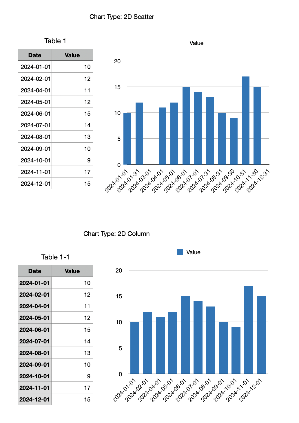
Things to know about 2D Scatter Chart.


Unlike with a 2D Line Chart, with requires a Header Column, the left column in the data table for a 2D Scatter Chart must NOT be defined as a Header Column (shaded by default).


To get a 2D Scatter Chart to look just like a 2D Column Chart you need to apply a few tricks.


Click the series in the chart and in the Series tab in the right panel add Y Axis Error Bars > Negative Only > Use Percentage > Range: 100.


Click on of the error bars that now appear in the chart and adjust the Bar Style, thickness, and color in the Error Bar panel at the right.


Click the series in the chart (at the top of an error bar; it can be a little tricky to click in just the right spot to select the series) and in the Style panel at the right choose None for Data Symbol.


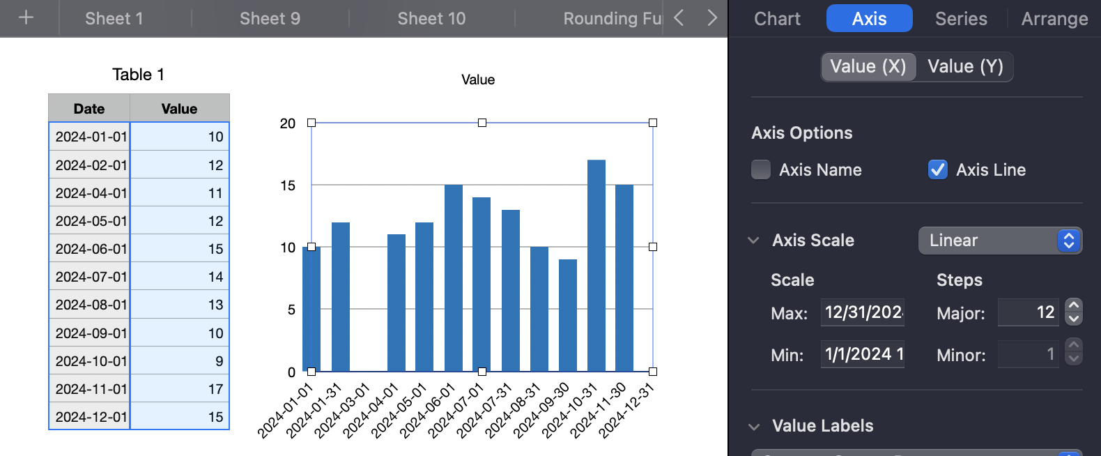
Then click the chart (not one of the elements within it) and go to the Axis tab at the right and choose the Value (X) tab. There you will need to vary the Min: Max: (enter dates for each) and the number of Steps. What worked for me (you would use 31/12/2024 instead for Max) for this example was this:


It's a little fiddly, but of course charts in Excel can be fiddly too, just fiddly in different ways.


With a little experimentation you should quickly get the hang of it. But if you get stuck, post again.


SG

Sep 20, 2024 1:42 PM in response to iwaddo

Put in a row for the missing date, with the missing date but no data. The X axis labels are just text and they will appear in the same order as in the table.


Excel seems to be making a scatter-type column chart when it sees dates as the X data. If you put them out of order in Excel, it plots them on the X axis like a scatter plot does, not in the order they appear in the table. The scatter plot idea seems to be more like what Excel is doing. But if you have more than one series, the scatter plot idea won't work.


Sep 21, 2024 4:47 AM in response to iwaddo

The Error Bars approach is versatile for many different kinds of effects.


If I remember correctly error bars in Excel can also be useful for many kinds of effects..


You are not limited to one data series. You can easily have more than one y value.


Turning the error bar on one series white can give you an effect like this.


etc., etc.!


SG

Sep 22, 2024 6:33 AM in response to iwaddo

Yes, Pivot Tables are flexible, great for looking at data in different ways.


But I avoid them as a basis for charts. I change them too often.


Basing a chart on an Intermediate table can be a great way to go.


And I'm sure you have discovered that you can create multiple charts based on the same table, compare them, and once you have decided on the best one, just delete the others.


An easy way to duplicate a chart: just click it and option-drag onto the canvas. Then modify the duplicate, leaving the original as is.


SG

Sep 24, 2024 6:01 AM in response to iwaddo

Go to the Axis tab in the sidebar and change the X axis minimum to something smaller than your first date so that the first bar shifts to the right. It can be the day before (at 12AM) or the day before at 12PM (or some other time), depending on what looks best. Then uncheck "show minimum value".


Personally, I'd be trying to figure out how to use an actual column chart. If you are thinking of creating interim tables for the charts, you can automate them with functions to pull in the data in from your main table and create a table suitable for an actual column chart. For instance, you can provide a starting date and it can make each row from there down be all the following days, including the missing days. Or it can start with the first date in your table and you won't have to do anything. Lookup functions can fill in the rest of the data, assuming there are no repeated dates. With this table, with all the missing days in it, you can create an actual column chart.


Or we can take a stab at putting the missing days in your main table and reworking your simple formulas so they can span the extra rows. Personally I prefer this idea but I haven't seen your formulas yet.

Sep 24, 2024 2:01 AM in response to SGIII

Hi


Two further questions if I may


  1. Can I get two data series to stack? Currently they are occupying the same space.
  2. Is there a way to move the left most bar so it is not centrally aligned to the left border, it look like it is outside of the chart. Turning borders off lessens the problem visually?


Thank you for your help.

Sep 22, 2024 4:03 AM in response to SGIII

I'm thinking my best option is to create a number of interim tables from which to create the charts I want.


A set of simple two column tables with the date in the first and a sumifs() in the second from which I can create the 2D Scatter charts.


I tried a pivotable but that also does seem to see the date as a timeline and omits the missing months.


Thank you for your help.

Dates on x-axis with gaps if there is no data

Welcome to Apple Support Community
A forum where Apple customers help each other with their products. Get started with your Apple Account.