I am not sure what you are adding, and how you are adding.
Look at the pic below a cut-out view of your screenshot from your post.
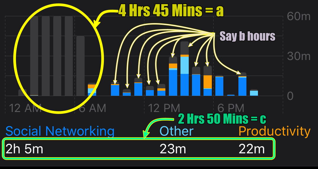
Total Screen Time is a+b+c
In order to understand this better read this example below.
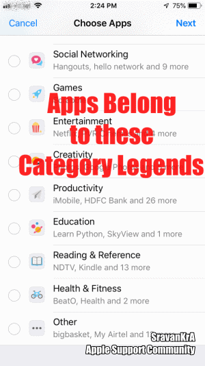
There are 9 Categories in Screen Time
- Social Networking: Facebook, Hangout, Instagram
- Games: Scrabble, PUBG
- Entertainment: Netflix, Amazon Music
- Creativity: Photos, Google Photos
- Productivity: HDFC Bank
- Education: SkyView, Learn Python
- Reading & Reference: Kindle, NDTV
- Health & Fitness: BeatO, Health, Activity
- Others: Big Basket,
The graph displays the top 3 (Time used by the user) category legends on X-axis. Anything other than these legend categories is a Grey bar in the graph
For example:
If the user has used Games, Entertainment & Others category apps for the maximum time during a time span then the graph will show these three categories in the X-axis as legends and the remaining categories will be shown in Grey Colour.
The GIF below will illustrate the graph from 3 iOS devices
iPhone 6 iOS 12.4.5
iPhone SE iOS 13.3.1
iPad Pro 9.7" Wifi+Cellular iOS 13.3.1
Understanding Screen Time Graph (Grey Bar explained)
All apps have been assigned to certain categories in iTunes. Screen Time has chosen the top 8 categories and has put all remaining categories in a category called "Others".
There are 9 Categories in Screen Time
- Social Networking: Facebook, Hangout, Instagram
- Games: Scrabble, PUBG
- Entertainment: Netflix, Amazon Music
- Creativity: Photos, Google Photos
- Productivity: HDFC Bank
- Education: SkyView, Learn Python
- Reading & Reference: Kindle, NDTV
- Health & Fitness: BeatO, Health, Activity
- Others: Big Basket,
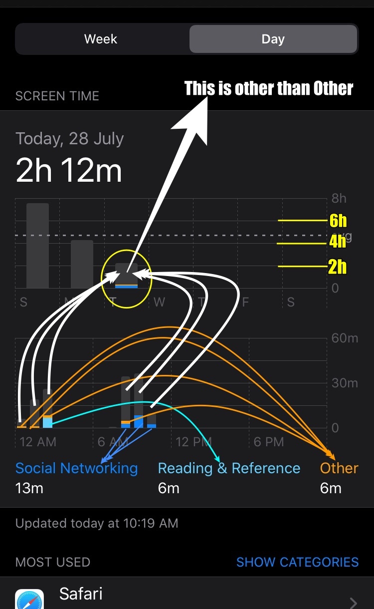
The graph displays the top 3 (Time used by the user) category legends on X-axis. Anything other than these legend categories is Grey bar in the graph
For example:
If the user has used Social Networking, Reading and Reference and Others category apps for the maximum time during a time span. The graph will show these three categories in the X-axis as legends and remaining categories (Remaining apps which have used less than 6 min account for what is being shown in Grey Colour.
See the pic below explained