No, Mr. Taylor…
The problem is:
1) Of course, I have tto first click the “Edit” button/icon.
In this, when I use pencils and brushes, the round colour icon in the bottom right works for those tools But…
2) when I want to add Text or Shapes on the image, I have to first click the Mark up button/icon..yes.. as you said.. for which I have to click the “+” sign/icon on the bottom-right off the iPhone screen.
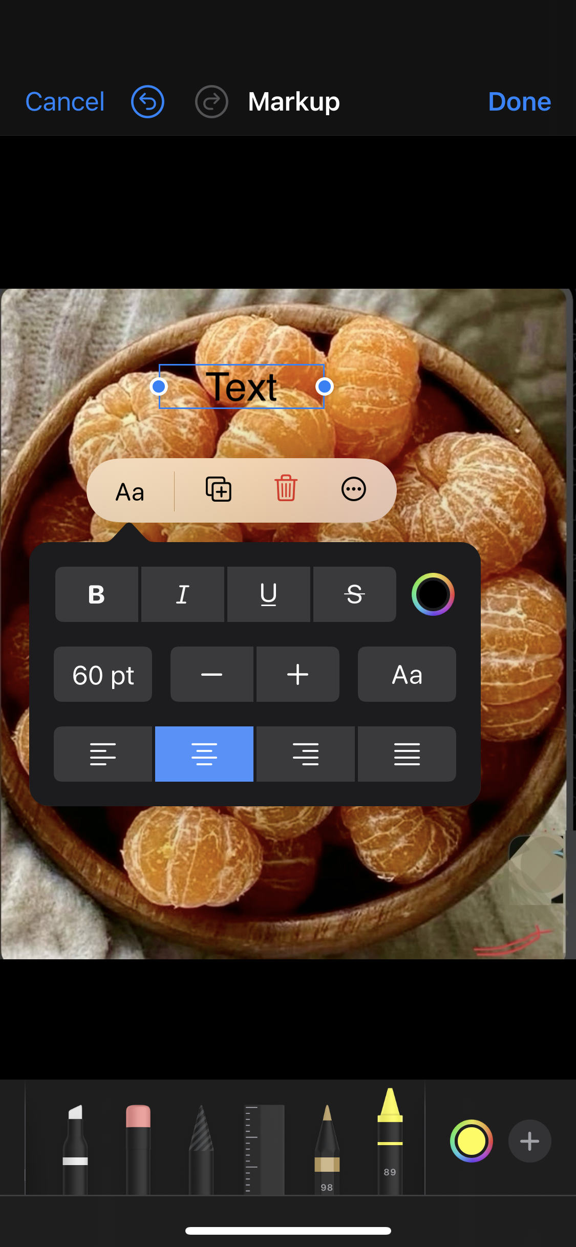
Then: Inside that;- when I click Shapes or Text option, it appears, but along with another icon bar (as shown in screenshot below).
And also, the main colour icon (second in the bottom right of screen) stops working. And so then, I have to use the new popped up icon bar…and icons in it to chose and give colour to the Text or Shapes (see screenshot below).
So, when I press the “Aa” icon on the new icon bar, a big colour palette box pops up which blocks essentially too much of the screen.
Also;- it’s (the box’s) surrounding one or two empty inches outside the border of the box… on all sides are also under the effect of the box..i.e. if I select a colour from the box’s surroundings, it is a shade lighter or off, and not the original colour there which I wish to select.
So:- the box destroys the essence and ability-possibility of doing the colour process easily.
This happens in processing the text as well as the shapes.
And then appear newer icons (on the new icon bar) of arrow and line etc. in case of my getting an arrow shape.
Aslo:- the moving of the box is also nearly not possible straightaway.
I have to pull it and it moves only in small increments.. up down, which is useless.
And I have to move the text or shape somewhere else to make the box follow it. But even then, the screen is practically covered by the box, making editing most agony-full.
Also:- the other options of actions on shapes alterations and fonts etc are in the new icon bar.
This makes editing most painful.
Ideally, everything should be in the bottom block of icons, on the screen.
[Edited by Moderator]