You can make a difference in the Apple Support Community!

When you sign up with your Apple Account, you can provide valuable feedback to other community members by upvoting helpful replies and User Tips.

Looks like no one’s replied in a while. To start the conversation again, simply ask a new question.

How do I eliminate gaps caused by missing data in a Numbers line chart?

Others have suggested deleting rows (dates) with no data, but this doesn't work for two reasons. (1)I have multiple lines (columns) with missing data at different dates for different columns. (2)The time axis must be uniform to accurately represent slopes.


The default broken-line display doesn't display well since some data displays as nearly solid lines while others become just points which get lost among the lines. I really need numbers just to connect the data points. Any suggestions other than switching to Excel which is much poorer at formatting multiple charts per page?

Mac Studio

Posted on Oct 12, 2022 4:28 PM

Reply
Question marked as Top-ranking reply

Posted on Oct 12, 2022 6:24 PM

You are probably better off doing it in Excel but you can do it in Numbers with some effort, if it is a scatter chart.
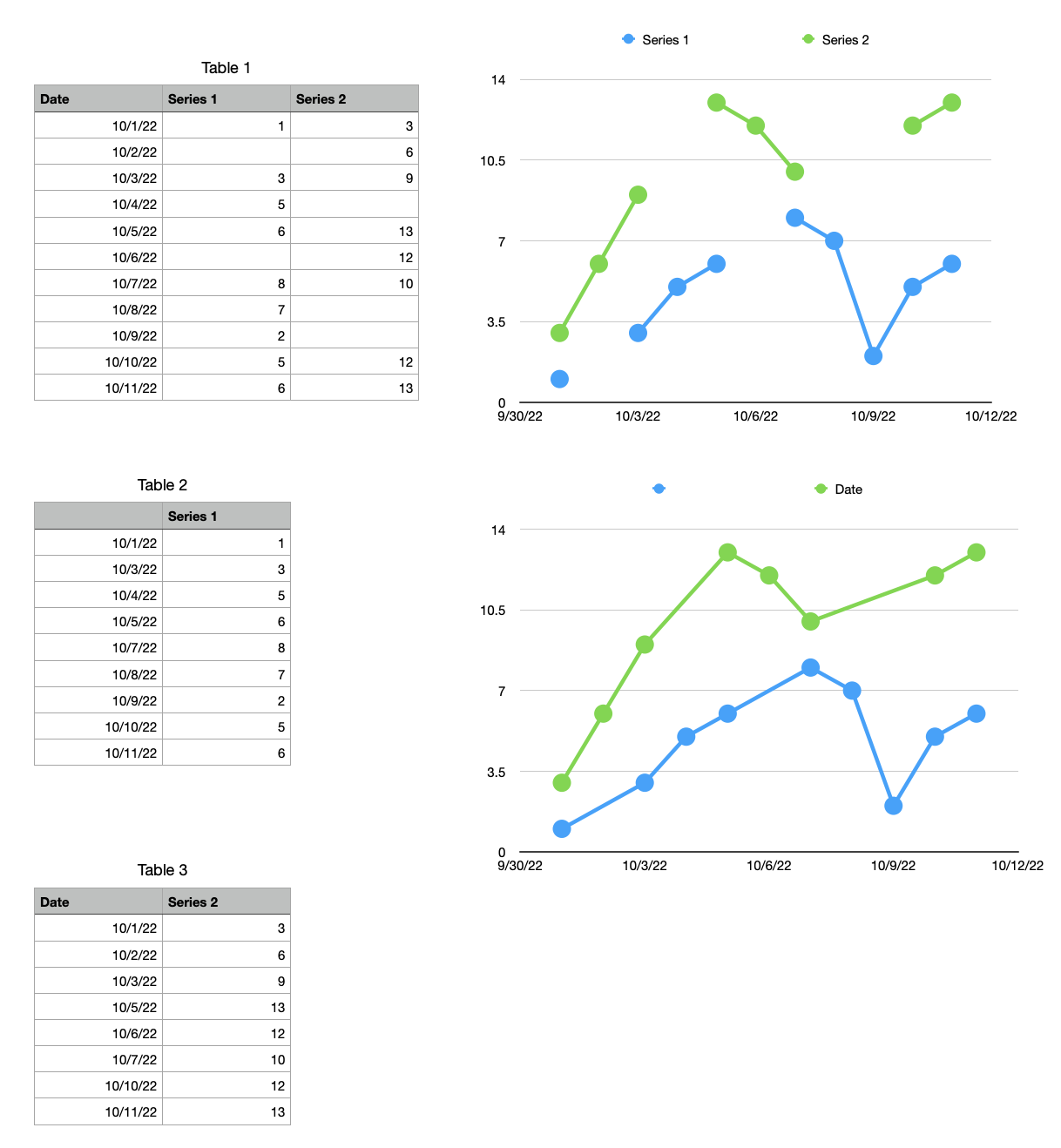


Top chart is a scatter chart from Table 1, with the problem of broken lines. The lower chart is a scatter chart of tables 2 and 3, both of which have a filter on them hiding empty rows and the chart is set to not show hidden data (the default setting).


Make Tables 2 and 3 as long or longer than Table 1. The screenshot is showing them with a filter turned on. There are more rows than what is shown (and hidden rows in the middle).


Formulas in Table 1 are

A1 =Table 1::A

B1 =IF(Table 1::B≠"",Table 1::B,"")

Copy/paste those to the rest of the cells in their columns


Formulas in Table 3 are

A1 =Table 1::A

B1 =IF(Table 1::C≠"",Table 1::C,"")

Copy/paste to those rest of the cells in their columns


Now that the tables are made

  1. Create a scatter chart of Table 2
  2. Choose to not share X values (important to do this step)
  3. Edit Data References and select the cells in Table 3 to be included in the chart (both columns)
  4. Click Done
  5. Choose to have straight connection lines for both series
  6. Use a quick filter on Tables 2 and 3 to hide blank rows (if that option is presented) and rows that are "".
  7. I think you will have to go to the format sidebar with the chart selected to change the name of each series so it points to the correct column header.
  8. That was about it, unless I left something out.


There is a second method where you create two charts then overlay one on top of the other but it can get tedious to align them properly and to keep them aligned.

Similar questions

4 replies
Question marked as Top-ranking reply

Oct 12, 2022 6:24 PM in response to Joe Veranth

You are probably better off doing it in Excel but you can do it in Numbers with some effort, if it is a scatter chart.


Top chart is a scatter chart from Table 1, with the problem of broken lines. The lower chart is a scatter chart of tables 2 and 3, both of which have a filter on them hiding empty rows and the chart is set to not show hidden data (the default setting).


Make Tables 2 and 3 as long or longer than Table 1. The screenshot is showing them with a filter turned on. There are more rows than what is shown (and hidden rows in the middle).


Formulas in Table 1 are

A1 =Table 1::A

B1 =IF(Table 1::B≠"",Table 1::B,"")

Copy/paste those to the rest of the cells in their columns


Formulas in Table 3 are

A1 =Table 1::A

B1 =IF(Table 1::C≠"",Table 1::C,"")

Copy/paste to those rest of the cells in their columns


Now that the tables are made

  1. Create a scatter chart of Table 2
  2. Choose to not share X values (important to do this step)
  3. Edit Data References and select the cells in Table 3 to be included in the chart (both columns)
  4. Click Done
  5. Choose to have straight connection lines for both series
  6. Use a quick filter on Tables 2 and 3 to hide blank rows (if that option is presented) and rows that are "".
  7. I think you will have to go to the format sidebar with the chart selected to change the name of each series so it points to the correct column header.
  8. That was about it, unless I left something out.


There is a second method where you create two charts then overlay one on top of the other but it can get tedious to align them properly and to keep them aligned.

Oct 12, 2022 6:19 PM in response to Joe Veranth

I just answered my own question, so here it is FYI. The key is making a SEPARATE TABLE FOR EACH LINE and using a SCATTER CHART. Start with the master table with multiple Y-data columns and a bunch of empty cells for display. If there are any formulas in the table (I used some to convert dates to "months since start") replace them with formula results. Then select the X-axis data and a SINGLE column of Y-data and insert a scatter chart with lines. There will be gaps. Now create an additional separate 2-column table for each column of Y-data (including the first) and copy the X-data and Y data columns from the master table into each. Now remove the extraneous rows from the first 2-column table, and as you do this the gaps should disappear from the chart without changing the X axis. Select the first data cell of the second 2-column table. Then select the chart, click "Edit Data References", and now select the entire data range in the second 2-column table. The columns should be labeled "X" and "Y". Getting this right may take a few undos and repeats, since it matters where your selection starts. The second line should now appear in the chart with gaps. Repeat for the other lines. Now remove the extraneous rows from all the 2-column tables and all the gaps should disappear.


How do I eliminate gaps caused by missing data in a Numbers line chart?

Welcome to Apple Support Community
A forum where Apple customers help each other with their products. Get started with your Apple Account.